An excerpt from “Visualizing Science: Illustration and Beyond”
Guest post by
Jen Christiansen

Jen is a senior graphics editor with the Scientific American.
The Sciviz Continuum: Figurative to Abstract
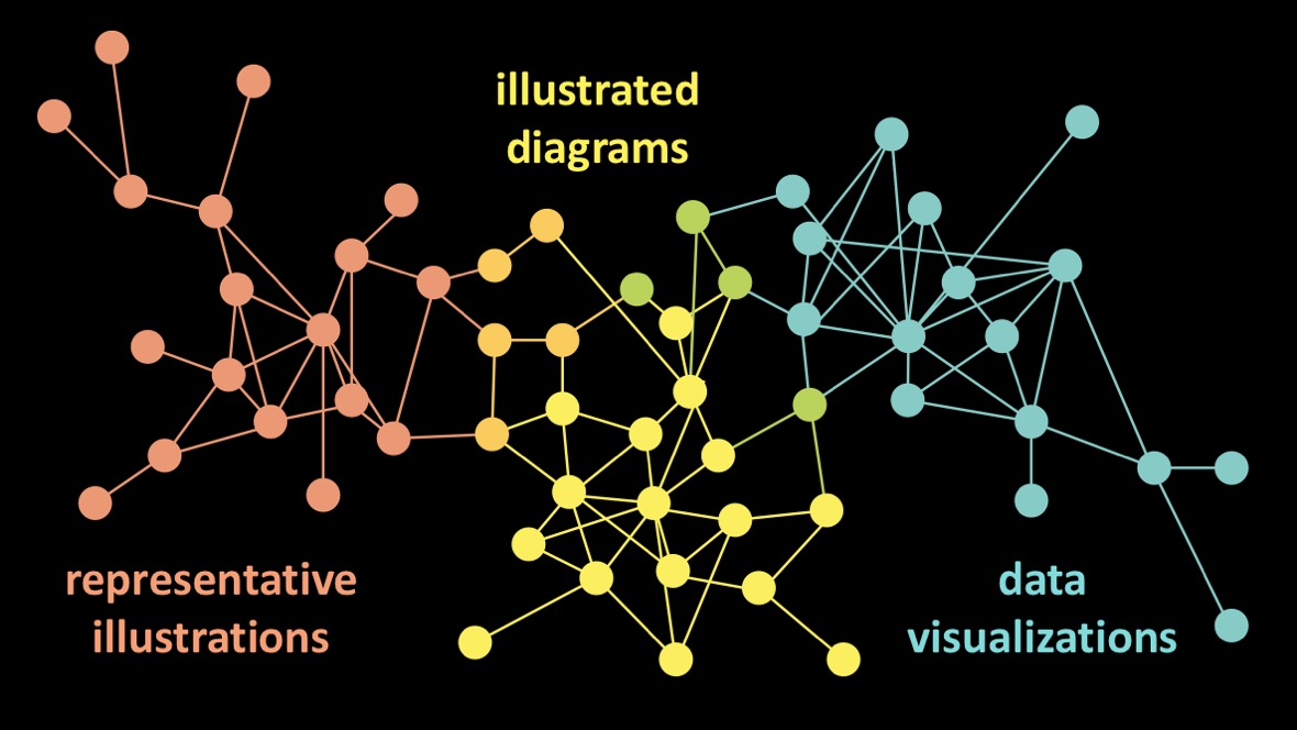
I tend to think of information graphics as a continuum, with figurative representations at one end and abstract representations on the other (see the first Figure below). In the world of science visualization, you could argue that the full continuum can also be referred to as data visualizations. After all, essentially all of our work is rooted in data collection at some stage in the process: from bone length measurements in dinosaur reconstructions, to meticulously documented laboratory experiments that build up to a more complete understanding of processes like photosynthesis, to representations of mathematical expressions (like Feynman diagrams), to straight-up plotting of the raw data itself, in chart form.
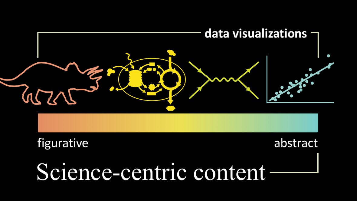
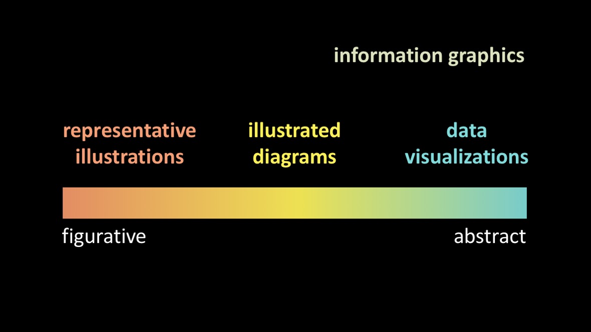
Outside of the world of science visualization, it may be more useful to think of the continuum like this:
When I flip through old issues of Scientific American, it strikes me that many artists worked across the full spectrum. But as a graphics editor at the magazine now, I find myself maintaining discrete freelance pools for each of the different points along the continuum.
Perhaps this is an artifact of my own biases, but it occurs to me that this increased specialization may also be in part due to the shifting tools of each of these areas. When the primary tool for developing representative illustrations, explanatory diagrams, and data visualizations for print magazines was pen and ink, an artist could become a master at pen and ink, then explore different methods of problem solving in each of these areas.
Since desktop publishing became ubiquitous and digital rendering tools diversified and became more widely available, it seems to me that the simple act of choosing a primary tool starts to define the edges of the artist’s scope. As an art director, I find myself specifically looking for 3D artists to build physical objects; folks who hone in on composition and the flow of information by iterating with tools like Adobe Illustrator for explanatory diagrams; and data designers that build solutions with code for visualizing large datasets.
Each of these tools, mediums, styles and genres take lots of time to master, and tend to favor certain portions of the continuum. Many of the conferences I attend and communities that I engage with seem to reinforce these divisions, by focusing on the tools. And it seems that artists that span more than one of these orbs are harder and harder to find.
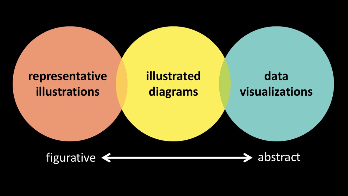
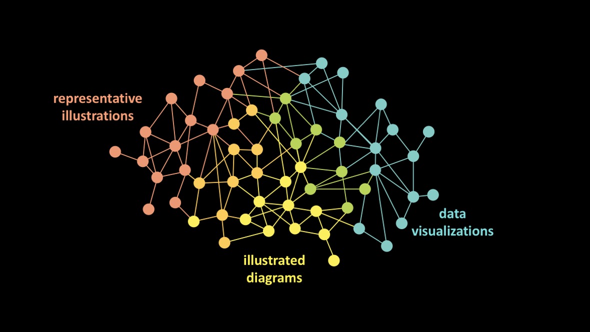
Perhaps that way of thinking about things is a bit overly dramatic. The reality is probably much more like this.
And perhaps this is a completely natural and fine state to be in—particularly since the primary tools for these different sub-disciplines have bifurcated over time. And perhaps there isn’t value in trying to force discrete clusters to reconnect.
That said, I argue that even if you don’t have the desire to work across the full continuum—or the time to dedicate to becoming proficient across the full continuum—there is lots to be learned from each of these clusters, and I’d love to see more cross pollination of ideas between them. I think we’d all benefit, if things looked more like this:
And even better, if things looked like this:
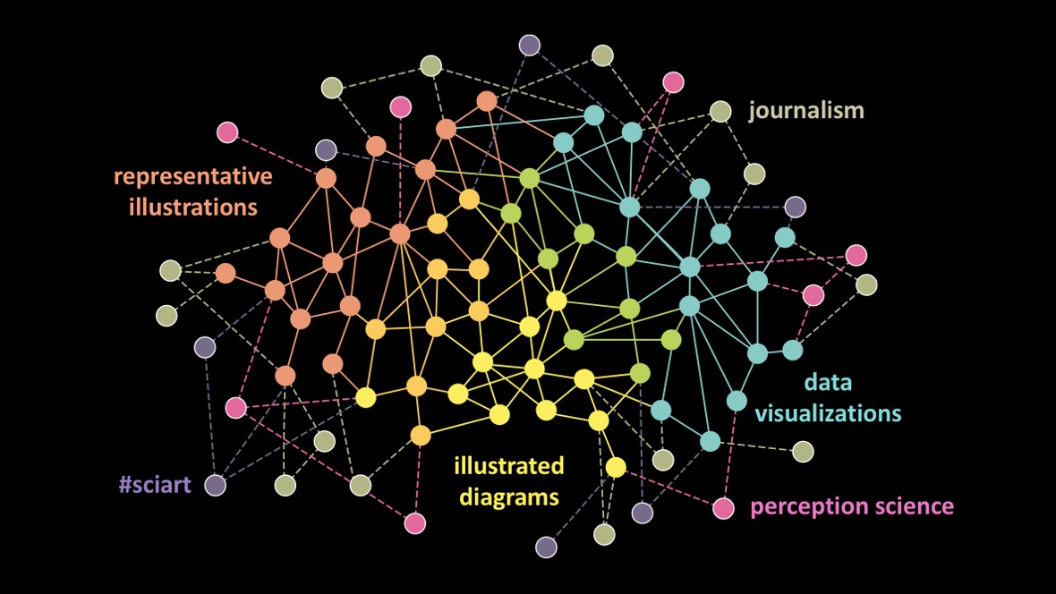
I’m not arguing that everyone along this continuum should learn how to code. Or that everyone along the continuum should build clay models and paint from life. I’m arguing that we can—and should—learn how science visualizers from cross the full spectrum think through and solve problems.
For the full post, see Visualizing Science: Illustration and Beyond.