 For hundreds of years, scientists have published their results in scientific journals that were printed on paper. Today, though, most journals have gone entirely online. Articles less and less frequently printed out and read on paper, so why should they still look and funciton exactly the way they did in the 1600s?
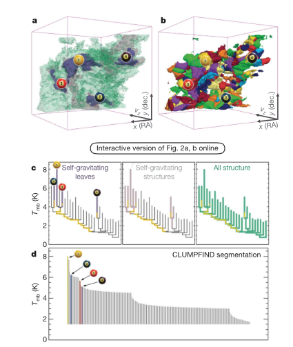
Josh Peek and I, and our colleagues wrote a fully online paper presenting The ‘Paper’ of the Future back in 2014, which highlights (with embedded demonstrations) many of the technologies available to scientists publishing today, and in the near future. One particularly important technology–“3DPDF”– discussed in that paper of the “future” was actually first deployed in a Nature article by my “Astronomical Medicine” collaborators and me, way back in 2009.
Our challenge was to show the difference between two “segmentation” techniques used to define salient structures inside of star-forming regions. The science isn’t important here (sorry). What’s important is that we wanted to offer the “reader” multiple, interactive, views of high-dimensional data, inside of a journal article.
To see the PDF in action, take a look at this video, or download the “nature_demo” file and open it, on any Mac or PC, with an Adobe PDF viewer of any kind (not Preview).
Other authors (e.g Peek 2012) have since published methods for creating these 3D PDFs using free software, and a (perhaps too small!) number of authors have now embedded these 3D images inside of the scholarly articles. Even though interactive images are clearly seen to add value to articles, they are not (yet) widely used. 3D PDF as a format may be short-lived, as articles move more and more to a fully online environment, where other (e.g. javascript-based) technologies can offer superior options. BUT, the general idea of embedding data and interactive views of it, be they “3D” or not, is extremely valuable, and we will return to it in future posts–for now go have a look at The ‘Paper’ of the Future (Goodman at al. 2014).