Are you making a comparison between data and/or predictions?
Is representing uncertainty a concern?
Most scientists today are familiar with the concept of an “error bar” (even if they don’t always agree on what exactly those bars represent.) The best modern visualizations often go far beyond a standard x-y plot where error bars can be useful, and novel solutions for showing uncertainty are often needed in high-dimensional data displays (maps, density plots, volume renderings). Simulations offer a particular challenge, as they are often carried out in abstract units that do not directly correspond to measurable quantities. Ideally, comparisons of simulations with real-world measurements, and the uncertainties associated with those simulations and measurements, are all contextualized using easily understood contextual views. Adding the path of an actual hurricane to the visualization of a simulation’s uncertainty, below, would encapsulate this question (which is really two questions!) all at once.
Example: Visualizing Uncertainty for a Simulated Hurricane Path
The map below illustrates the uncertainty in the path of a hurricane, superimposed on a map. The example is drawn from Mirzagar, Whitaker & Kirby’s 2014 work on translating ideas about standard box plots, as pioneered by John Tukey in 1969, to maps, with application to predicted geographic paths. The coloring on the visualization is summarized using the key at right, which resembles the standard standard box and whisker symbols, discussed below.

For an audience (see Question 1!) familiar with standard boxplots, the translation from Tukey’s ideas about encapsulating a distribution in a symbol (box & whisker, as shown at left) to this representation is relatively straightforward, though it might be confusing to novice users of statistical charts.
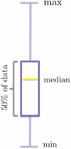 In a standard “boxplot,” also called a “box & whisker plot,” a rectangular box is used to outline the range of values representing the middle 50% of measurements, with a line across the box, not always in the middle of the range, marking the median of the distribution. “Whiskers” above and below the box are typically used to mark the minimum and maximum values in a distribution, unless there are distant outliers, which are then shown as dots beyond the “whiskers” (not shown in the diagram at right).
Source: Mirzargar, M., Whitaker, R. T., & Kirby, R. M. (2014). Curve boxplot: Generalization of boxplot for ensembles of curves. IEEE Transactions on Visualization and Computer Graphics, 20(12), 2654–2663. http://doi.org/10.1109/TVCG.2014.2346455
Last revised: 7th of July 2018, Alyssa Goodman