All 10QViz Posts

Here, you can search or browse all the posts created by our 10QViz expert community.  Use the search box, faceted searching tool, or the tag cloud to the right →
to search to your heart’s content! Anyone can annotate or comment on pages.   Please visit the How to… page if you need any guidance or instructions.

glue & the Webb Telescope ❤ a match made for the heavens!

How was this great match made?

On April 23, 2012 in an email, then-Space Telescope Science Institute Director Matt Mountain asked Harvard Professor Alyssa Goodman: 

“Presume through Alberto [Conti] you will touch base with the other JWST folks looking at IFU data visualization like Tracy Beck, Massimo (our Acting Head of the JWST[?].”  

Three days later, on a trip to Baltimore from Boston, Goodman was in Mountain’s office at STScI, where he showed her his copy of  her “Principles of High-Dimensional Data Visualization in Astronomy.”  Conti, then a NASA “Innovation Scientist,”  had shared Goodman’s draft with Mountain, knowing how relevant the “principles” in the paper could be for JWST data in the future.   To Goodman’s complete surprise, about 5 minutes into the conversation, Mountain offered Goodman (who was not actively seeking funding at the time) “something like a million dollars” to make the “glue” software described in the draft “real enough to use.” 

Note: Astronomers often still call the “Webb” or “James Webb” space telescope by its NASA acronym, “JWST.”

Why were these astronomers so interested in glue + JWST? 

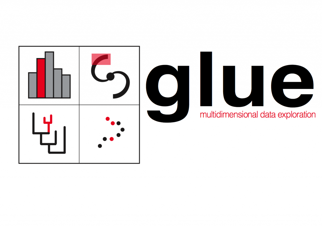
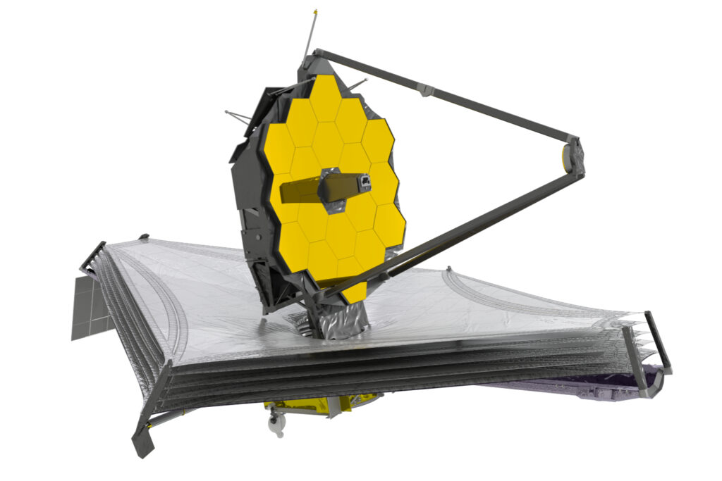
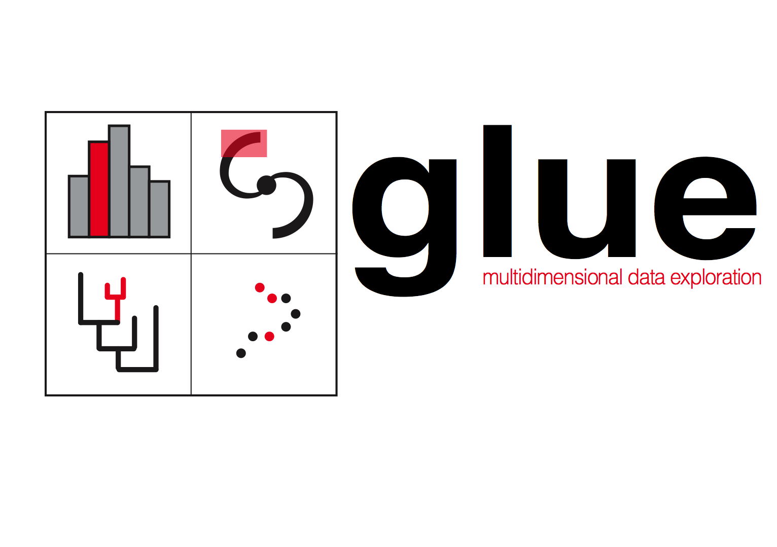
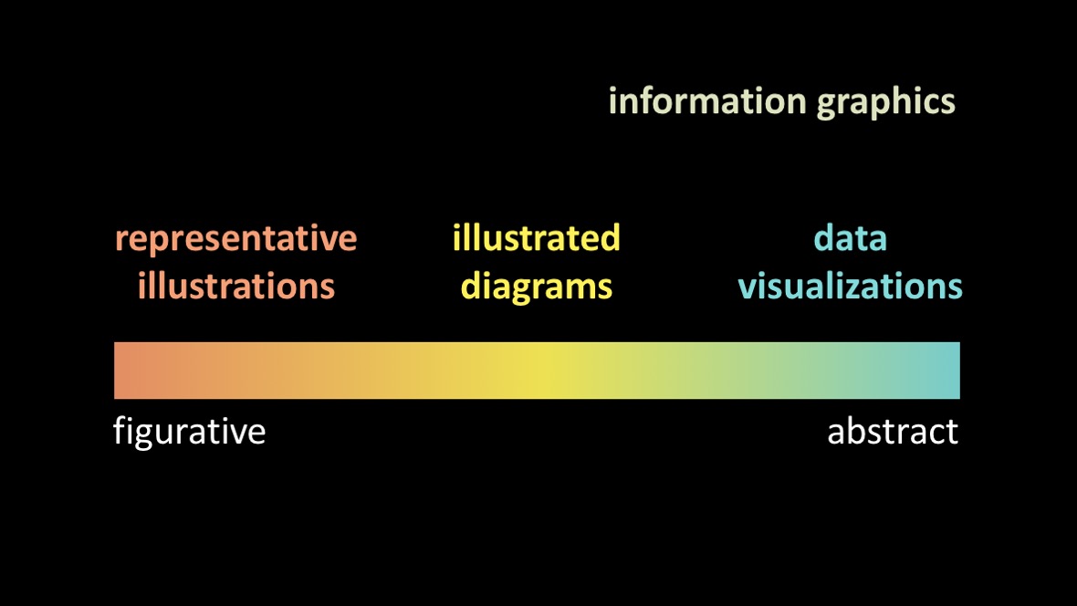
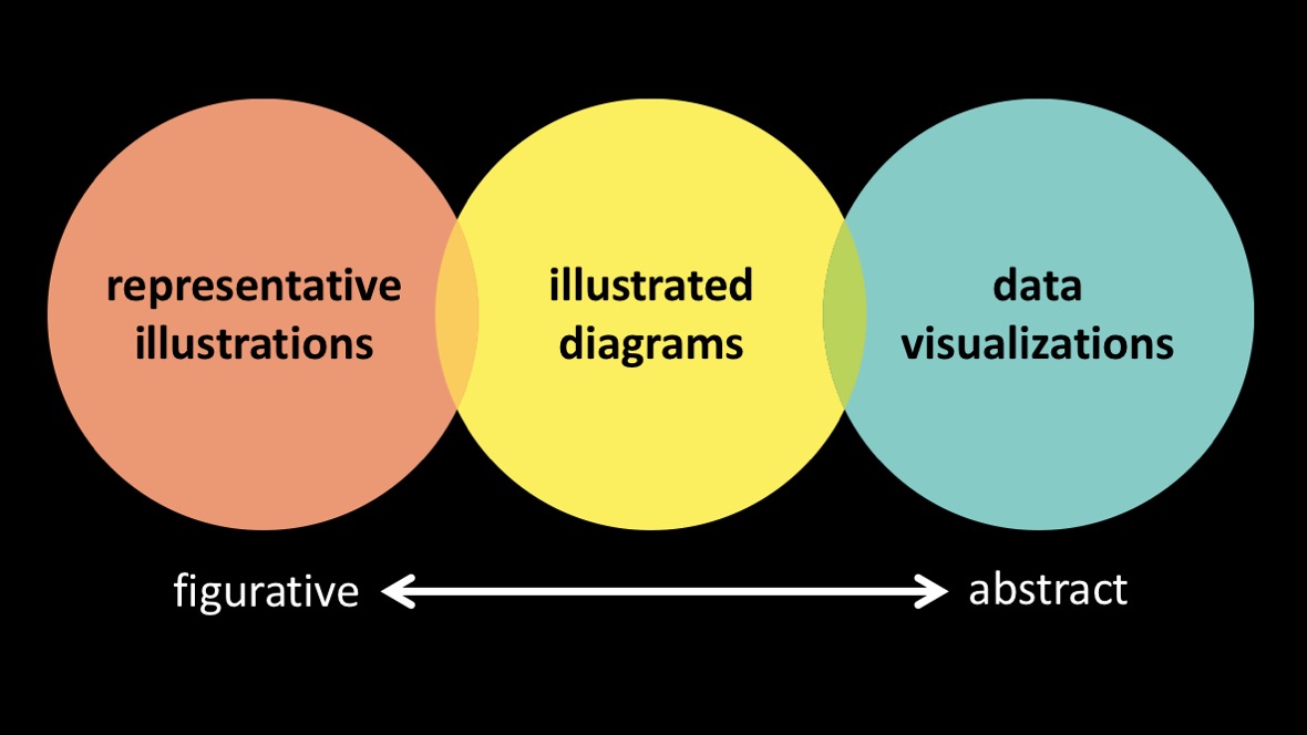
The Webb telescope doesn’t just take images.  It can take a spectrum, breaking up light into constituent colors, at many many positions within an image at once, using a device called an “Integral Field Unit.”  The resulting data format, which has “x-y” positions on the sky, plus a “z” axis that corresponds to wavelength, is called a “spectral line image cube.”  Astronomers trained to use radio telescopes, including Goodman, have used such cubes for decades.   Goodman and her colleagues designed glue to exploit both high-dimensional data (e.g. cubes) and the principles of “exploratory data analysis” shown in glue’s logo.   (The red-highlighted points and regions in the glue logo are all coordinated, in that salient values selected in any open display of data are also selected, live, in others.)

What’s glue done in a decade?

Now, ten years later, the glue software environment is a robust open-source ecosystem that underlies all of Jdaviz, the web-based analysis tools being provided to scientists as the way to analyze JWST data. Thanks to initial and ongoing support from the NASA-JWST program, as well as from the National Science Foundation and the Moore Foundation, the glue exploratory data analysis tools are now are now used in many astronomical investigations, in genomics, and in many other contexts.   

Recent astronomy-related discoveries made using glue include the discovery of the Radcliffe Wave and the Perseus-Taurus Supershell, and the star-forming significance of the Local Bubble around the Sun.  glue has also been used to produce the first augmented reality figures published in a major astronomy journal.

glue is also used to teach data science.  At the high-school/community college/college level, it’s a key element of the infrastructure powering the “Cosmic Data Stories” project of NASA’s Science Activation Program.  And, for more advanced data scientists, glue is being used to train data scientists in astronomy, for example in the “Seeing More of the Universe” YouTube series created by Alyssa Goodman for NSFs Rubin Data Science Fellows program. 

About Jdaviz

Jdaviz offers four special packages intended for different specific purposes.  All of the packages use JupyterNotebook, JupyterLab, glue, and many Astropy functions to accomplish their goals. The “Glupyter Framework Overview” page on the Jdaviz website gives a good summary of how glue-jupyter (also called “glupyter”) is used, and can be extended, within the jdaviz environment. 

The four packages that comprise Jdaviz are called “Imviz,” “Cubeviz,” “Mosviz,” and “Specviz,” and super-short descriptions of each, from the Jdaviz website, are shown below.   For power users’ reference, glue outside of Jdaviz can integrate functionality across all of the specific tasks accomplished in these four tools, simultaneously.  See the glue website or these online demo and training videos for more on how to use glue in its most flexible forms.
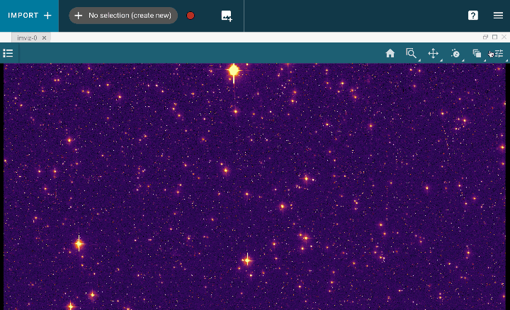
Imviz
Imviz is a tool for visualization and analysis of 2D astronomical images. It incorporates visualization tools with analysis capabilities, such as Astropy regions and photutils packages.
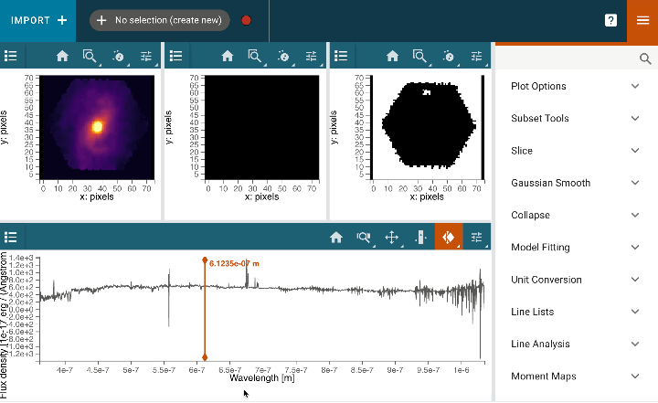
Cubeviz
Cubeviz is a visualization and analysis toolbox for data cubes from integral field units (IFUs). It is built as part of the Glue visualization tool. Cubeviz is designed to work with data cubes from the NIRSpec and MIRI instruments on JWST, and will work with IFU data cubes. It uses the specutils package from Astropy.
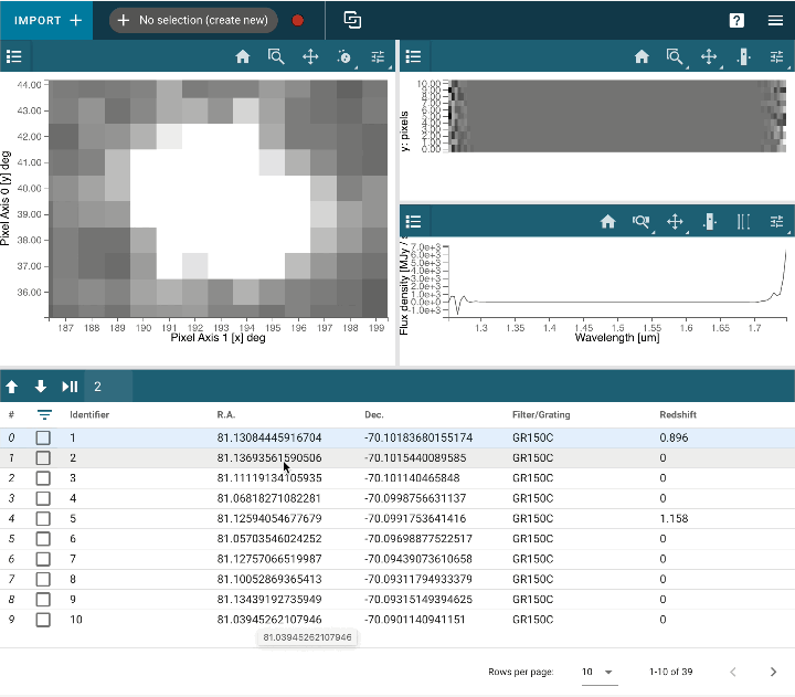
Mosviz
Mosviz is a quick-look analysis and visualization tool for multi-object spectroscopy (MOS). It is designed to work with pipeline output: spectra and associated images, or just with spectra.
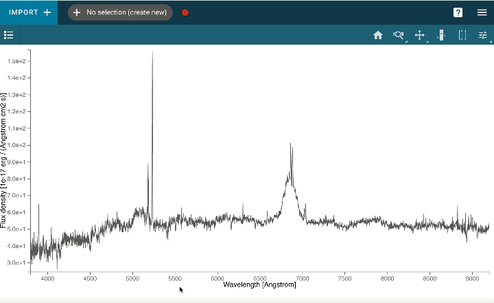
Specviz
Specviz is a tool for visualization and quick-look analysis of 1D astronomical spectra. It incorporates visualization tools with analysis capabilities, such as Astropy regions and specutils packages. Specviz … supports flexible spectral unit conversions, custom plotting attributes, interactive selections, multiple plots, and other features. Specviz notably includes a measurement tool for spectral lines which enables the user, with a few mouse actions, to perform and record measurements. It has a model fitting capability that enables the user to create simple (e.g., single Gaussian) or multi-component models (e.g., multiple Gaussians for emission and absorption lines in addition to regions of flat continua).

IHME COVID-19 Model Uncertainty Visualization


Why this post?

This post is motivated by a new interactive visualization tool provided by glue solutions, inc.  that allows for visual exploration of the evolution of the IHME models of the COVID-19 pandemic, over time. 

In the body of the post, we take a look at how uncertainty is represented in the original Institute for Health Metrics and Evaluation (IHME) deaths per day graphs for COVID-19, and then at the graphical features of the new interactive tool for exploring the IHME models’ predictive history.   An  essay online at the Prediction Project site offers context on why exploring the history of the IHME models graphically is so interesting.

➡ At this link, you can create your own graphical comparisons of  the IHME deaths/day model by clicking on the three dots at the top-right of each graphic there and downloading a PNG
➡ To join the discussion, please comment using the Disqus tool at the bottom of this post, which permits you to upload graphics with your comment.

The IHME Daily Deaths Display

Here’s an annotated sample of a typical IHME plot for the whole United States, with a very clean design, in which a solid red curve shows the record of past deaths, and a dashed red curve shows the models forecast of deaths/day, going in to the future.  The shaded red band shows a 95% confidence interval, illustrating the uncertainty in the model prediction. On the IHME web site, users can hover-over the plot to read off the forecast, with uncertainty information, dates in the future, or actual recorded deaths for dates in the past.

The glue solutions interactive tool for creating historical comparisons of IHME forecasts

Here is an annotated sample of output from the glue solutions interactive tool, for the United States.  In the glue solutions visualizations, in order to distinguish data from model, actual deaths/day are shown as red points, and all model information is shown in blue.  Shading for the (95%) confidence model works exactly as in the original IHME visualizations, only is shown in blue.  The average forecasts are shown as solid blue lines within the blue shaded uncertainty bands.

A graphical choice has been made to not assign different dates different colors. A multi-color option, for a small number of overlain models, does make it easier to distinguish which model is which, but as more and more models are overlain, the color in overlap regions turns to mud.  Choosing instead just one color (blue) for every model allows user to see a region of ever-darker blue, corresponding to the region of the graph where past models agree, as more and more models are added.

Choices have also been made on the glue solutions site presenting the interactive tool about how users can interact with these graphics. A time slider has been added outside of the graphic, and a date selector has been added on the right.  Constraints on these graphical choices were imposed by the Vega visualization grammar.  (For example, the developer of the tool, Jonathan Foster, would have liked to add: color in the graph title, a slider within the graph, and more responsive features for mobile, but Vega could not allow those features when this graphic was made).

The Sciviz Continuum: Figurative to Abstract

An excerpt from “Visualizing Science: Illustration and Beyond”
Guest post by
Jen Christiansen


Jen is a senior graphics editor with the Scientific American.

The Sciviz Continuum: Figurative to Abstract

I tend to think of information graphics as a continuum, with figurative representations at one end and abstract representations on the other (see the first Figure below). In the world of science visualization, you could argue that the full continuum can also be referred to as data visualizations. After all, essentially all of our work is rooted in data collection at some stage in the process: from bone length measurements in dinosaur reconstructions, to meticulously documented laboratory experiments that build up to a more complete understanding of processes like photosynthesis, to representations of mathematical expressions (like Feynman diagrams), to straight-up plotting of the raw data itself, in chart form.

Outside of the world of science visualization, it may be more useful to think of the continuum like this:

When I flip through old issues of Scientific American, it strikes me that many artists worked across the full spectrum. But as a graphics editor at the magazine now, I find myself maintaining discrete freelance pools for each of the different points along the continuum.

Perhaps this is an artifact of my own biases, but it occurs to me that this increased specialization may also be in part due to the shifting tools of each of these areas. When the primary tool for developing representative illustrations, explanatory diagrams, and data visualizations for print magazines was pen and ink, an artist could become a master at pen and ink, then explore different methods of problem solving in each of these areas.

Since desktop publishing became ubiquitous and digital rendering tools diversified and became more widely available, it seems to me that the simple act of choosing a primary tool starts to define the edges of the artist’s scope. As an art director, I find myself specifically looking for 3D artists to build physical objects; folks who hone in on composition and the flow of information by iterating with tools like Adobe Illustrator for explanatory diagrams; and data designers that build solutions with code for visualizing large datasets.

Each of these tools, mediums, styles and genres take lots of time to master, and tend to favor certain portions of the continuum. Many of the conferences I attend and communities that I engage with seem to reinforce these divisions, by focusing on the tools. And it seems that artists that span more than one of these orbs are harder and harder to find.

Perhaps that way of thinking about things is a bit overly dramatic. The reality is probably much more like this.

And perhaps this is a completely natural and fine state to be in—particularly since the primary tools for these different sub-disciplines have bifurcated over time. And perhaps there isn’t value in trying to force discrete clusters to reconnect.

That said, I argue that even if you don’t have the desire to work across the full continuum—or the time to dedicate to becoming proficient across the full continuum—there is lots to be learned from each of these clusters, and I’d love to see more cross pollination of ideas between them. I think we’d all benefit, if things looked more like this:

And even better, if things looked like this:

I’m not arguing that everyone along this continuum should learn how to code. Or that everyone along the continuum should build clay models and paint from life. I’m arguing that we can—and should—learn how science visualizers from cross the full spectrum think through and solve problems.

For the full post, see Visualizing Science: Illustration and Beyond.

“Save the pies for dessert”?

Included in Stephen Few’s very interesting visualization blog (perceptual edge) is the provocatively titled “Save the Pies for Dessert” post.   Pie charts are notoriously bad for perceptually judging magnitude. Here is an annotated excerpt from Few’s post, giving just one example of how hard it can be to judge scale using pie charts…

Not everyone hates pie charts, though…for example, here is a blog post from “Junk Charts” on the downside of discouraging pie charts.

Bonus: An amusing pie chart which shows the shadow illusion featured in the Categories question is this fascinating little image. Once you see the pyramid, you cannot unsee it:


Pyramid pie chart art.

I did not manage to identify the original maker of this -sort of- meme at this point, if you know, please tell me in the comments. Image above is copied from Rebecca Barter here: http://www.rebeccabarter.com/blog/2015-07-23-pie/

Another case made against the rainbow colors

Rainbow colors are pretty, and many of us like them. However, go to any visualization-related conference, and you’ll hear a lot of ‘rainbow-hate’. Where does that come from? Below is an excellent example that shows how rainbow color tables might mislead and make us see categories, or patterns, that might not be there. The image below is featured in a blog post titled “How The Rainbow Color Map Misleads” by Robert Kosara, in his wonderful visualization and visual communication blog eagereyes:

There is more to the art and science of choosing colors. Here is another informative post by Lisa Charlotte Rost: https://blog.datawrapper.de/colors/

Maybe a treemap would be better?

Consider this infographic about imprisonment, from this article on the American Legislative Exchange Council blog.   Most people would look at it and find it very engaging and attractive, which it is.  But, as a visualization expert, one wonders if the odd coloring variations in the outer ring of the main figure and in the “Juvenile” block at right, which just show how the larger wedges (categories) divide up more finely  (into sub-categories) wouldn’t be better shown in a Tree Map, using the ideas about showing hierarchical categories proposed by Ben Shneiderman in the 199os.   A Tree Map version of these data would almost certainly show the area of sub-categories and categories relative to each other (context) better than the snazzy graphic shown here.

Why (and what is) a “3D PDF”?

For hundreds of years, scientists have published their results in scientific journals that were printed on paper.  Today, though, most journals have gone entirely online.  Articles less and less frequently printed out and read on paper, so why should they still look and funciton exactly the way they did in the 1600s?

Josh Peek and I, and our colleagues wrote a fully online paper presenting The ‘Paper’ of the Future back in 2014, which highlights (with embedded demonstrations) many of the technologies available to scientists publishing today, and in the near future.   One particularly important technology–“3DPDF”– discussed in that paper of the “future” was actually first deployed in a Nature article by my “Astronomical Medicine” collaborators and me, way back in 2009.

Our challenge was to show the difference between two “segmentation” techniques used to define salient structures inside of star-forming regions.  The science isn’t important here (sorry).  What’s important is that we wanted to offer the “reader” multiple, interactive, views of high-dimensional data, inside of a journal article.

To see the PDF in action, take a look at this video, or download the “nature_demo” file and open it, on any Mac or PC, with an Adobe PDF viewer of any kind (not Preview).

Other authors (e.g Peek 2012) have since published methods for creating these 3D PDFs using free software, and a (perhaps too small!) number of authors have now embedded these 3D images inside of the scholarly articles.   Even though interactive images are clearly seen to add value to articles, they are not (yet) widely used.  3D PDF as a format may be short-lived, as articles move more and more to a fully online environment, where other (e.g. javascript-based) technologies can offer superior options.  BUT, the general idea of embedding data and interactive views of it, be they “3D” or not, is extremely valuable, and we will return to it in future posts–for now go have a look at The ‘Paper’ of the Future (Goodman at al. 2014).

But what about software!?

We knew this might be the first question you’d ask! One of the 10VizQ founders (Alyssa Goodman) is quite involved in making new visualization software, and in the scientific software world in general, so she promised to make posts about software from time to time. At present, Alyssa’s pet project is “glue,” which is a python-based (but GUI enabled) tool for exploring diverse data sets using linked views. She’ll make a separate post on glue soon–it’s utility applies across all 10 Questions.  Ok… Alyssa finally made that new glue post, in honor of the release of the first color images from the James Webb Space Telescope.  Here it is!