Why this post?
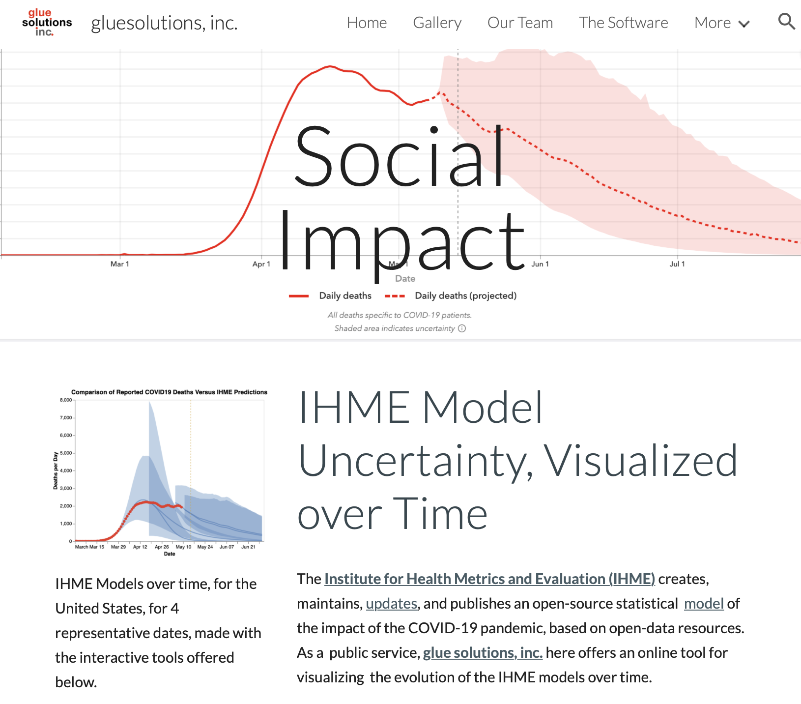
 This post is motivated by a new interactive visualization tool provided by glue solutions, inc. that allows for visual exploration of the evolution of the IHME models of the COVID-19 pandemic, over time.
In the body of the post, we take a look at how uncertainty is represented in the original Institute for Health Metrics and Evaluation (IHME) deaths per day graphs for COVID-19, and then at the graphical features of the new interactive tool for exploring the IHME models’ predictive history. An essay online at the Prediction Project site offers context on why exploring the history of the IHME models graphically is so interesting.
| ➡ At this link, you can create your own graphical comparisons of the IHME deaths/day model by clicking on the three dots at the top-right of each graphic there and downloading a PNG |
| ➡ To join the discussion, please comment using the Disqus tool at the bottom of this post, which permits you to upload graphics with your comment. |
The IHME Daily Deaths Display
Here’s an annotated sample of a typical IHME plot for the whole United States, with a very clean design, in which a solid red curve shows the record of past deaths, and a dashed red curve shows the models forecast of deaths/day, going in to the future. The shaded red band shows a 95% confidence interval, illustrating the uncertainty in the model prediction. On the IHME web site, users can hover-over the plot to read off the forecast, with uncertainty information, dates in the future, or actual recorded deaths for dates in the past.
The glue solutions interactive tool for creating historical comparisons of IHME forecasts
Here is an annotated sample of output from the glue solutions interactive tool, for the United States. In the glue solutions visualizations, in order to distinguish data from model, actual deaths/day are shown as red points, and all model information is shown in blue. Shading for the (95%) confidence model works exactly as in the original IHME visualizations, only is shown in blue. The average forecasts are shown as solid blue lines within the blue shaded uncertainty bands.
A graphical choice has been made to not assign different dates different colors. A multi-color option, for a small number of overlain models, does make it easier to distinguish which model is which, but as more and more models are overlain, the color in overlap regions turns to mud. Choosing instead just one color (blue) for every model allows user to see a region of ever-darker blue, corresponding to the region of the graph where past models agree, as more and more models are added.
Choices have also been made on the glue solutions site presenting the interactive tool about how users can interact with these graphics. A time slider has been added outside of the graphic, and a date selector has been added on the right. Constraints on these graphical choices were imposed by the Vega visualization grammar. (For example, the developer of the tool, Jonathan Foster, would have liked to add: color in the graph title, a slider within the graph, and more responsive features for mobile, but Vega could not allow those features when this graphic was made).
