TL;DR: Throughout history, people have recorded events on timelines. This post is about the remarkably varied design space of timelines as explanation tools.
We begin our timeline adventure with a primer on spatial metaphors for time.

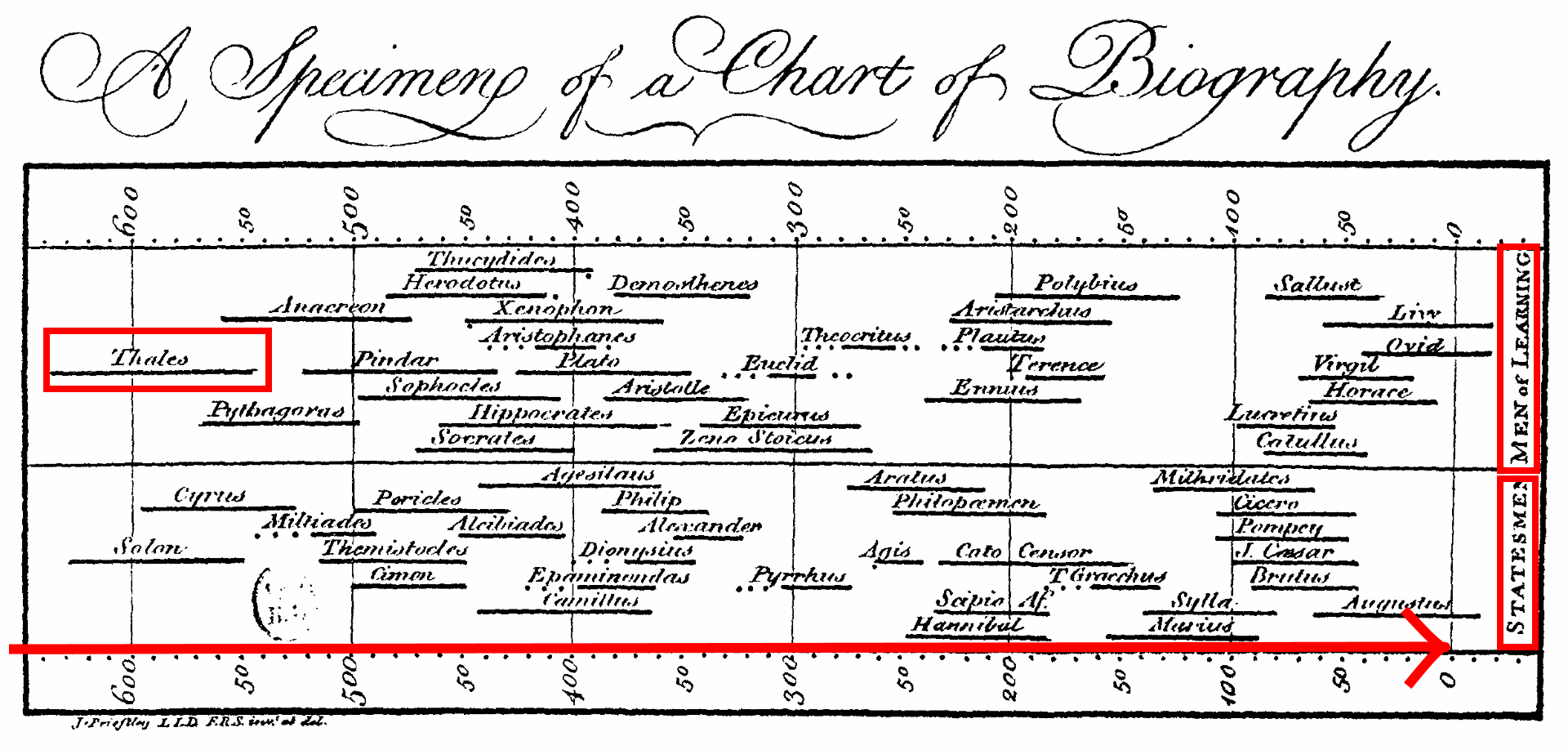
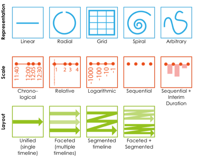
Perhaps the most common representation for time is linear: the “time as an arrow” metaphor. Consider Joseph Priestley’s “Chart of Biography”, published over 250 years ago. In Priestley’s design, time is mapped from left to right (the dates are BCE). You can see the lifespans of a number historical figures, offset vertically to avoid overdrawing. Otherwise there’s no meaning to the vertical placement aside from faceting the data with statesmen at the bottom and philosophers at the top. This left-to-right linear representation of time remains popular today, but it is certainly not the only way to explain a set of events.

Alternative representations of time
Radial representations are especially effective when explaining and highlighting natural cycles and events that repeat, such as biological life cycles or the seasons of the year. However, time is both linear and cyclic, something that repeats and yet coils upwards or forwards. Thus, spirals are certainly another way to represent time, though one that is less common than the line or the circle. Yet another representation for time is the grid, often manifesting as a calendar. Like radial representations, calendars are good for showing repeating events and deviations from patterns of events, especially when these patterns correspond to conventions of weeks and months.

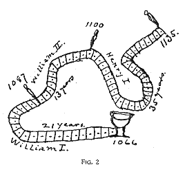
The last category of representation doesn’t conform to any specific shape. Mark Twain drew whimsical curved timelines for remembering dates along annotated curves. Many timeline infographics that we see today still have this freeform board-game-like appearance.
What is a timeline for? Timelines as explanation tools
These different spatial metaphors for time are one dimension of a timeline design space. Before introducing the second dimension, consider the following question: What is a timeline for? Why do we draw these in the first place?
Basically, a timeline can be used to explain “what happened when?”. If you unpack this question, a timeline can answer a number of more detailed questions. In what sequence did events occur? How long were they? Did event A and event B co-occur? And when did they occur relative to some baseline event? These questions relate to the second dimension of a timeline design space, and that pertains to time scale.
Frames of reference: Alternative time scales
As an example, consider Visualising Painters’ Lives by Accurat, depicting the lives of notable 20th century painters. In these timelines, each lifespan, artistic period, travel, and romantic conquest for several famous painters appear along a common chronological scale.
This video shows a simplified timeline representing the career of Salvador Dalí, inspired by Accurat’s project. You can see his artistic periods like Surrealism and Dada and his travel to places like Paris. As the video progresses, the career of Matisse now shown alongside Dalí’s. Using a common chronological scale, you will notice that were born at different times. You will see when their respective Cubist and Abstract periods took place and how they might have influenced one another. When the scale changes to one relative their birth dates, you can now compare the age at which they started their art career and how long they lived. You can also spot similarities like how they both traveled to Paris in their early thirties. Finally, the aspect of chronological duration disappears altogether, and what remains is simply a sequential ordering of their artistic periods. Ultimately, each of these transformations resulted in a different timeline, telling a different story.
A third dimension of the timeline design space is layout, or how to draw one or more timelines within a page or display. You could draw a single timeline. You could facet the events into multiple timelines, such as by drawing one timeline per famous painter. Or you could wrap a single timeline into meaningful segments of time, like a decade or a century.
The origin of this timeline design space
This design space arose from a research project led by Matthew Brehmer in collaboration with Bongshin Lee, Nathalie Henry Riche, Benjamin Bach, and Tamara Munzner. The team collected and categorized 145 timelines and timeline visualization tools from various sources, which helped them identify the dimensions of the design space. Next, they verified that the design space could be used to label 118 additional timelines from different sources. They also implemented points in the design space with 28 event datasets. These datasets varied in a number of ways: the number of events, the temporal extent of the events, and the rate of event co-ocurrence.
This process of categorization and implementation also led the researchers to identify 20 viable points in the design space. These points are combinations of representation, scale, and layout that are purposeful in terms of their communicative intent, interpretable in terms of which perceptual task the viewer is expected to make, and generalizable across a range of timeline datasets. This thumbnail gallery acts as a visual index for these points in the design space, and at timelinesrevisited.github.io, you will find each of these example designs in detail along with a description of what narrative or communicative intent they serve.
Considerations for storytelling with timelines
So now that you have all of these design choices, how do you use these design choices to craft explanations with timelines? How do you combine different points in this design space? This is important because despite the variety of ways that we visually represent and scale time, existing timeline presentation tools limit us to linear representations and chronological time scales. Existing tools also tend toward a chronological narrative. Some tools show the entire timeline as a static image, and viewers are therefore likely to begin at the start of the timeline. Alternatively, other tools reveal events one at a time in chronological order.
For some stories, a chronological introduction of events makes sense, while for others it does not. Consider the painters example, in which the career of Matisse adds context to the career of Dalí. Additionally, to achieve expressive narrative design, you can make use of animation, highlighting, and annotation to incrementally reveal parts of a narrative, and allow the viewer to make new comparisons.
Creative routine timelines
A second example attempts to tie all of these design considerations together. This video presents the daily routines of famous creative people, one inspired by infographics by Podio and RJ Andrews (a.k.a. Info We Trust), which in turn drew from Mason Currey‘s 2013 book Daily Rituals: How Artists Work.
In this video, you will encounter a set of radial timelines depicting a typical 24 hours in the lives of 26 writers, artists, composers, and the like. When they work, eat, sleep, exercise, and do other activities. A good starting point is to ask: when do creative people create? Are people similar in this regard? You can also ask about the relationship between sleep and creativity. What about variation and creativity? A chronological scale isn’t the best way to convey the number or heterogeneity of activities. Instead, it’s better to use a sequential scale to highlight these aspects. And to determine who varied the most and least, a linear representation is perhaps better than a radial one. Toward the end of the video, a chronological scale returns. This scale allows you to compare timelines just by scanning up and down, to spot synchronocities such as who works or sleeps at the same time of day. It also invites you to compare your own daily rhythm to those of these creative people.
Conclusion
Despite the apparent simplicity of the question of “What happened when?”, this post hopefully relayed the richness of the timeline design space. You have different visual representations and different time scales at your disposal that serve different communicative purposes. This design space grows even richer when you use dynamic storytelling elements like incremental reveal, selective highlighting, animated transitions, and an annotation layer comprised of labels and captions (metadata for events or for the timeline itself, respectively).
Timeline Storyteller
The tool that generated the video examples in this post is an interactive visualization authoring and presentation tool called Timeline Storyteller, a realization of the timeline design space and the considerations for storytelling described above. This tool is open-source and free to use in your browser at timelinestoryteller.com. It was released by Microsoft Research as an open-source web application in January 2017, and later as a free add-on to Microsoft Power BI, which allows you to publish timeline stories such as iFrames (here’s an example). You can also see Timeline Storyteller featured in the opening keynote of the 2017 Microsoft Data Insights Summit and in a 2017 OpenVisConf presentation, or you can read about it in a 2019 Computation + Journalism symposium paper.

Great content! Super high-quality! Keep it up! 🙂