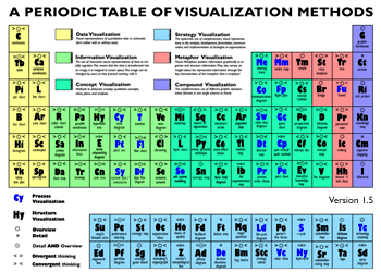
In 2007, for their paper entitled Towards a Periodic Table of Visualization Methods for Management, Lengler & Eppler created the static graphic shown here. Later, Chris Wallace created an interactive javascript version, now hosted at the excellent visual-literacy.org web site.
 This fun table has SO much to teach us about visualization–just think about all the 10QViz “Questions” to which it directly relates…
Primarily–the highly successful table is about “explaining” what’s meant by different kinds of visualization, but it (especially the interactive display mode) also let’s a user “explore” how those visualizations relate to each other. The table’s two dimensional layout, mimics the periodic table of the elements, familiar to most viewers (cf. “Who?”), and suggests (and labels) categorical groupings (shown in patterns of color and position). The interactivity adds hugely rich “metadata,” by way of examples for each cell in the table.
Reference for the Original Table: “Towards A Periodic Table of Visualization Methods for Management”
Lengler R., Eppler M. (2007). Towards A Periodic Table of Visualization Methods for Management. IASTED Proceedings of the Conference on Graphics and Visualization in Engineering (GVE 2007), Clearwater, Florida, USA. More on the history of the interactive version of the table can be found in this blog.
