Categories

Here’s the ongoing 10QViz community CONVERSATION about CATEGORIES

“Save the pies for dessert”?

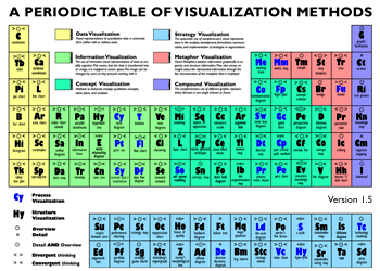
Included in Stephen Few’s very interesting visualization blog (perceptual edge) is the provocatively titled “Save the Pies for Dessert” post.   Pie charts are notoriously bad for perceptually judging magnitude. Here is an annotated excerpt from Few’s post, giving just one example of how hard it can be to judge scale using pie charts…

Not everyone hates pie charts, though…for example, here is a blog post from “Junk Charts” on the downside of discouraging pie charts.

Bonus: An amusing pie chart which shows the shadow illusion featured in the Categories question is this fascinating little image. Once you see the pyramid, you cannot unsee it:


Pyramid pie chart art.

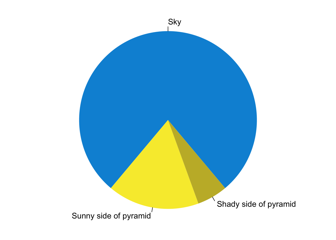
I did not manage to identify the original maker of this -sort of- meme at this point, if you know, please tell me in the comments. Image above is copied from Rebecca Barter here: http://www.rebeccabarter.com/blog/2015-07-23-pie/

Another case made against the rainbow colors

Rainbow colors are pretty, and many of us like them. However, go to any visualization-related conference, and you’ll hear a lot of ‘rainbow-hate’. Where does that come from? Below is an excellent example that shows how rainbow color tables might mislead and make us see categories, or patterns, that might not be there. The image below is featured in a blog post titled “How The Rainbow Color Map Misleads” by Robert Kosara, in his wonderful visualization and visual communication blog eagereyes:

There is more to the art and science of choosing colors. Here is another informative post by Lisa Charlotte Rost: https://blog.datawrapper.de/colors/

Maybe a treemap would be better?

Consider this infographic about imprisonment, from this article on the American Legislative Exchange Council blog.   Most people would look at it and find it very engaging and attractive, which it is.  But, as a visualization expert, one wonders if the odd coloring variations in the outer ring of the main figure and in the “Juvenile” block at right, which just show how the larger wedges (categories) divide up more finely  (into sub-categories) wouldn’t be better shown in a Tree Map, using the ideas about showing hierarchical categories proposed by Ben Shneiderman in the 199os.   A Tree Map version of these data would almost certainly show the area of sub-categories and categories relative to each other (context) better than the snazzy graphic shown here.