How was this great match made?
On April 23, 2012 in an email, then-Space Telescope Science Institute Director Matt Mountain asked Harvard Professor Alyssa Goodman:
“Presume through Alberto [Conti] you will touch base with the other JWST folks looking at IFU data visualization like Tracy Beck, Massimo (our Acting Head of the JWST[?].”
Three days later, on a trip to Baltimore from Boston, Goodman was in Mountain’s office at STScI, where he showed her his copy of her “Principles of High-Dimensional Data Visualization in Astronomy.” Conti, then a NASA “Innovation Scientist,” had shared Goodman’s draft with Mountain, knowing how relevant the “principles” in the paper could be for JWST data in the future. To Goodman’s complete surprise, about 5 minutes into the conversation, Mountain offered Goodman (who was not actively seeking funding at the time) “something like a million dollars” to make the “glue” software described in the draft “real enough to use.”
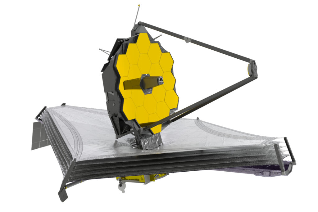
Note: Astronomers often still call the “Webb” or “James Webb” space telescope by its NASA acronym, “JWST.”
Why were these astronomers so interested in glue + JWST?
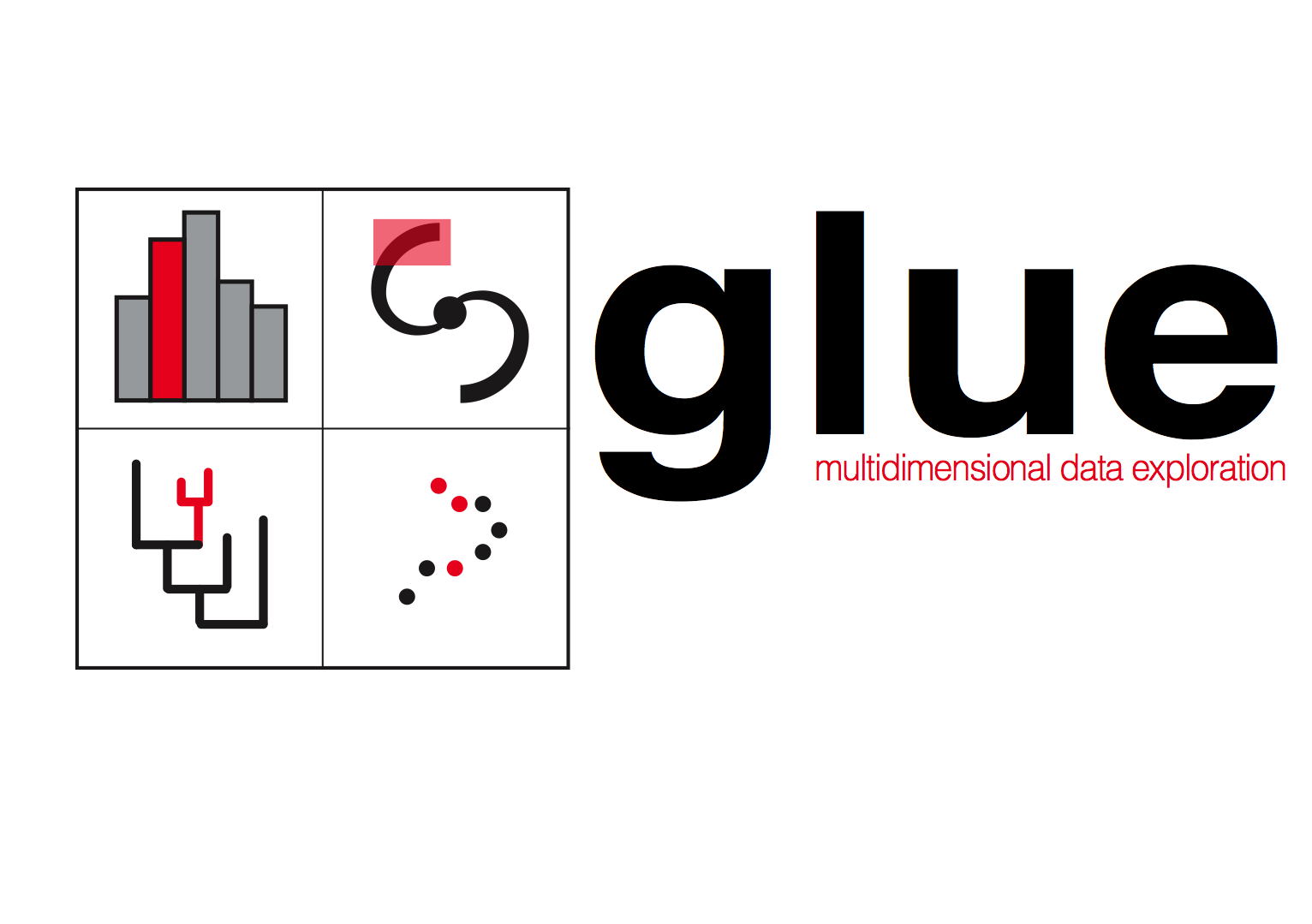
The Webb telescope doesn’t just take images. It can take a spectrum, breaking up light into constituent colors, at many many positions within an image at once, using a device called an “Integral Field Unit.” The resulting data format, which has “x-y” positions on the sky, plus a “z” axis that corresponds to wavelength, is called a “spectral line image cube.” Astronomers trained to use radio telescopes, including Goodman, have used such cubes for decades. Goodman and her colleagues designed glue to exploit both high-dimensional data (e.g. cubes) and the principles of “exploratory data analysis” shown in glue’s logo. (The red-highlighted points and regions in the glue logo are all coordinated, in that salient values selected in any open display of data are also selected, live, in others.)
What’s glue done in a decade?
Now, ten years later, the glue software environment is a robust open-source ecosystem that underlies all of Jdaviz, the web-based analysis tools being provided to scientists as the way to analyze JWST data. Thanks to initial and ongoing support from the NASA-JWST program, as well as from the National Science Foundation and the Moore Foundation, the glue exploratory data analysis tools are now are now used in many astronomical investigations, in genomics, and in many other contexts.
Recent astronomy-related discoveries made using glue include the discovery of the Radcliffe Wave and the Perseus-Taurus Supershell, and the star-forming significance of the Local Bubble around the Sun. glue has also been used to produce the first augmented reality figures published in a major astronomy journal.
glue is also used to teach data science. At the high-school/community college/college level, it’s a key element of the infrastructure powering the “Cosmic Data Stories” project of NASA’s Science Activation Program. And, for more advanced data scientists, glue is being used to train data scientists in astronomy, for example in the “Seeing More of the Universe” YouTube series created by Alyssa Goodman for NSFs Rubin Data Science Fellows program.
About Jdaviz
Jdaviz offers four special packages intended for different specific purposes. All of the packages use JupyterNotebook, JupyterLab, glue, and many Astropy functions to accomplish their goals. The “Glupyter Framework Overview” page on the Jdaviz website gives a good summary of how glue-jupyter (also called “glupyter”) is used, and can be extended, within the jdaviz environment.
The four packages that comprise Jdaviz are called “Imviz,” “Cubeviz,” “Mosviz,” and “Specviz,” and super-short descriptions of each, from the Jdaviz website, are shown below. For power users’ reference, glue outside of Jdaviz can integrate functionality across all of the specific tasks accomplished in these four tools, simultaneously. See the glue website or these online demo and training videos for more on how to use glue in its most flexible forms.
Imviz
Imviz is a tool for visualization and analysis of 2D astronomical images. It incorporates visualization tools with analysis capabilities, such as Astropy regions and photutils packages.
Cubeviz
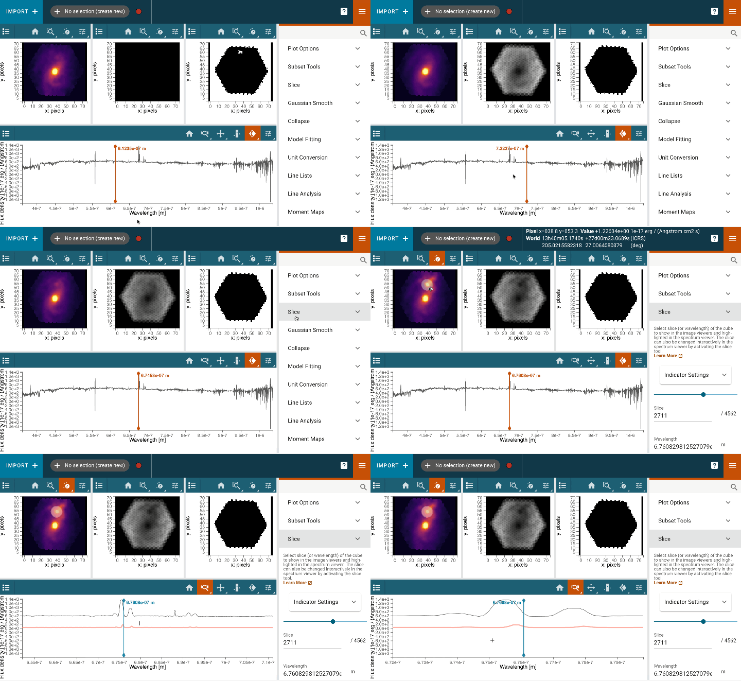
Cubeviz is a visualization and analysis toolbox for data cubes from integral field units (IFUs). It is built as part of the Glue visualization tool. Cubeviz is designed to work with data cubes from the NIRSpec and MIRI instruments on JWST, and will work with IFU data cubes. It uses the specutils package from Astropy.
Mosviz
Mosviz is a quick-look analysis and visualization tool for multi-object spectroscopy (MOS). It is designed to work with pipeline output: spectra and associated images, or just with spectra.
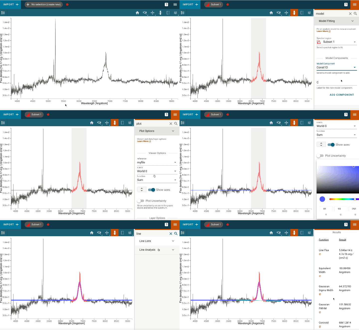
Specviz
Specviz is a tool for visualization and quick-look analysis of 1D astronomical spectra. It incorporates visualization tools with analysis capabilities, such as Astropy regions and specutils packages. Specviz … supports flexible spectral unit conversions, custom plotting attributes, interactive selections, multiple plots, and other features. Specviz notably includes a measurement tool for spectral lines which enables the user, with a few mouse actions, to perform and record measurements. It has a model fitting capability that enables the user to create simple (e.g., single Gaussian) or multi-component models (e.g., multiple Gaussians for emission and absorption lines in addition to regions of flat continua).
